

The concept for the new logo was inspired by an artifact from the museum’s history: a vintage melting pot used when the museum served as a trading warehouse. The warehouse, strategically located within the active harbors, served as a key hub for trade among Greenland, the Faroe Islands, and Denmark. Whale blubber was processed in copper vessels such as this to produce lamp fuel.
Inspired by this historical artifact, I envisioned the melting pot as a symbolic representation of the museum’s diverse cultural mixture. As my design exploration progressed, I integrated elements of water ripples, further enriching the visual narrative and imbuing the logo with layers of meaning and significance.


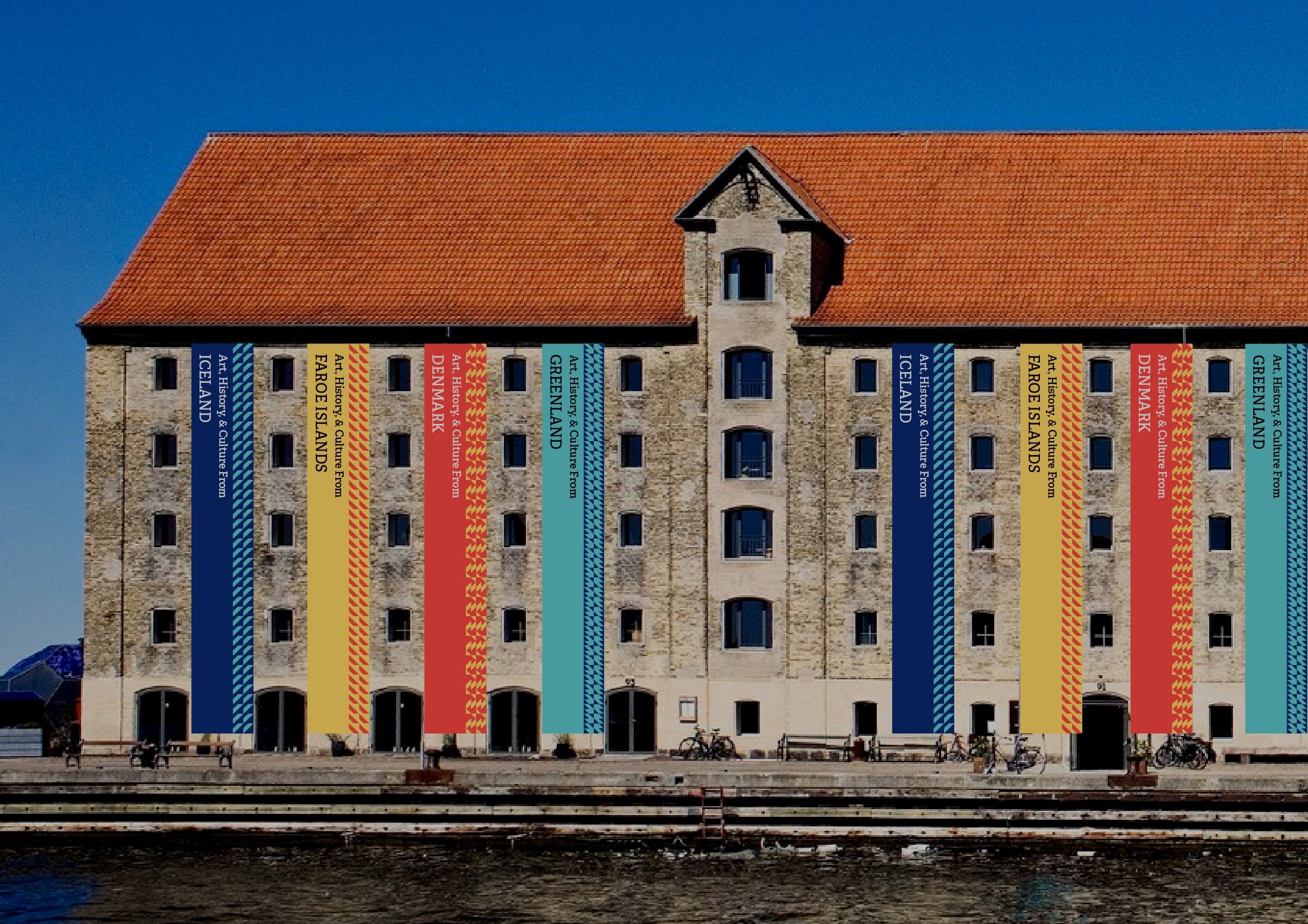
Following thorough evaluation, I selected the melting pot logo to symbolize the museum’s concert hall, which serves as an exemplary venue for hosting events that celebrate the diverse cultures displayed within the museum. I used the alternative logo as the focal point of the museum’s branding strategy, each segment of which symbolizes a distinct country featured within its exhibits.


&


Summer, 2023
About.
Studying abroad was one of the requirements for my Bachelor of Fine Arts degree. I have always admired the clean, efficient elements of Nordic design and chose to study Scandinavian graphic design at DIS in Denmark, Finland, and Sweden. During this time, my classmates and I were assigned the project of rebranding Copenhagen’s Nordatlantens Brygge, a museum that presents aspects of Danish, Icelandic, Faroese, and Greenlandic cultures. To accomplish this, I designed a visual identity that unified the unique qualities of each nation.
This project included a diverse range of deliverables—logos, animations, posters, and website wireframes—all thoughtfully crafted to reflect the museum’s multicultural narrative.
Skills.
Branding
Poster Design
Layout Design